Redesigning the Duo Admin Panel
In 2016, Duo.com received an updated look and feel from our in-house Creative team. They pushed us into a new age of design for Duo, ushering in cleaner type aesthetics, bolder graphics, and a focus on putting our messaging and content first.
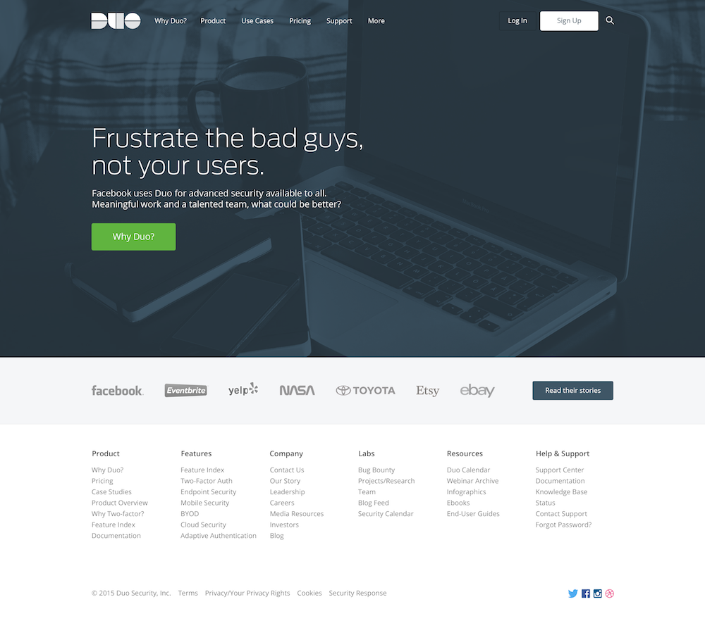
While we’ve added new features and new edition names to the Admin Panel, the look and feel has lagged behind our public website. During this time, Duo.com refined its visual language, a visual language we are expanding on to build a consistent look and feel across our product.
Before:
After:
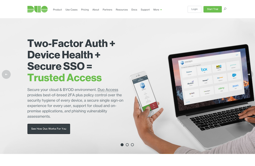
We’re updating the look and feel of the Admin Panel to create consistency across all touchpoints with Duo because it builds trust. It matters in the language that you read, but it also extends through to the visual language.
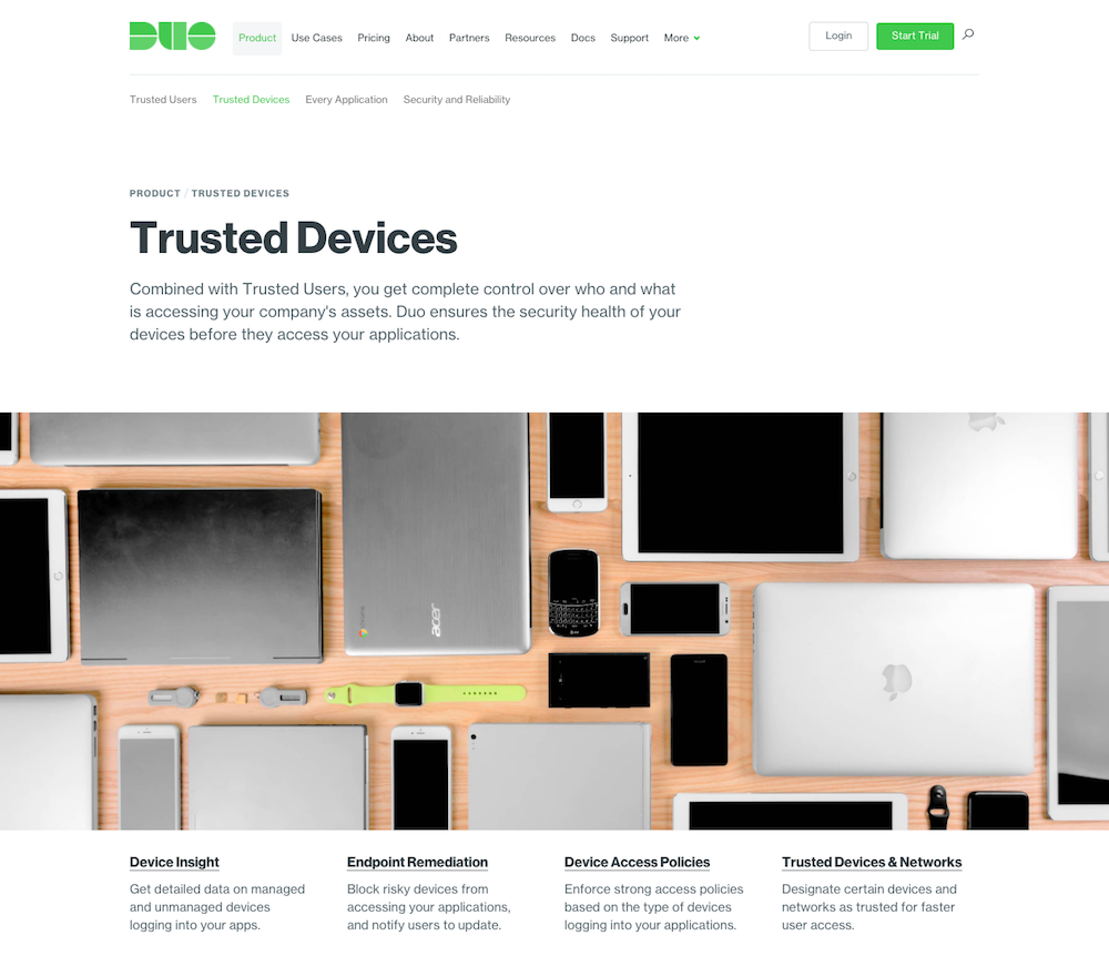
It can be visually jarring for a new user to go to the Duo.com site, read up on Duo, decide that they would like to sign up for a trial, land in the Admin Panel and realize that it looks nothing like Duo.com. There’s also a visual disconnect for existing customers that may receive an email about a new feature, then go to the Admin panel to check it out. That email you received will likely have the new Duo.com look and feel, while the Admin Panel does not.
New Look on Duo.com:
Old Look in the Duo Admin Panel
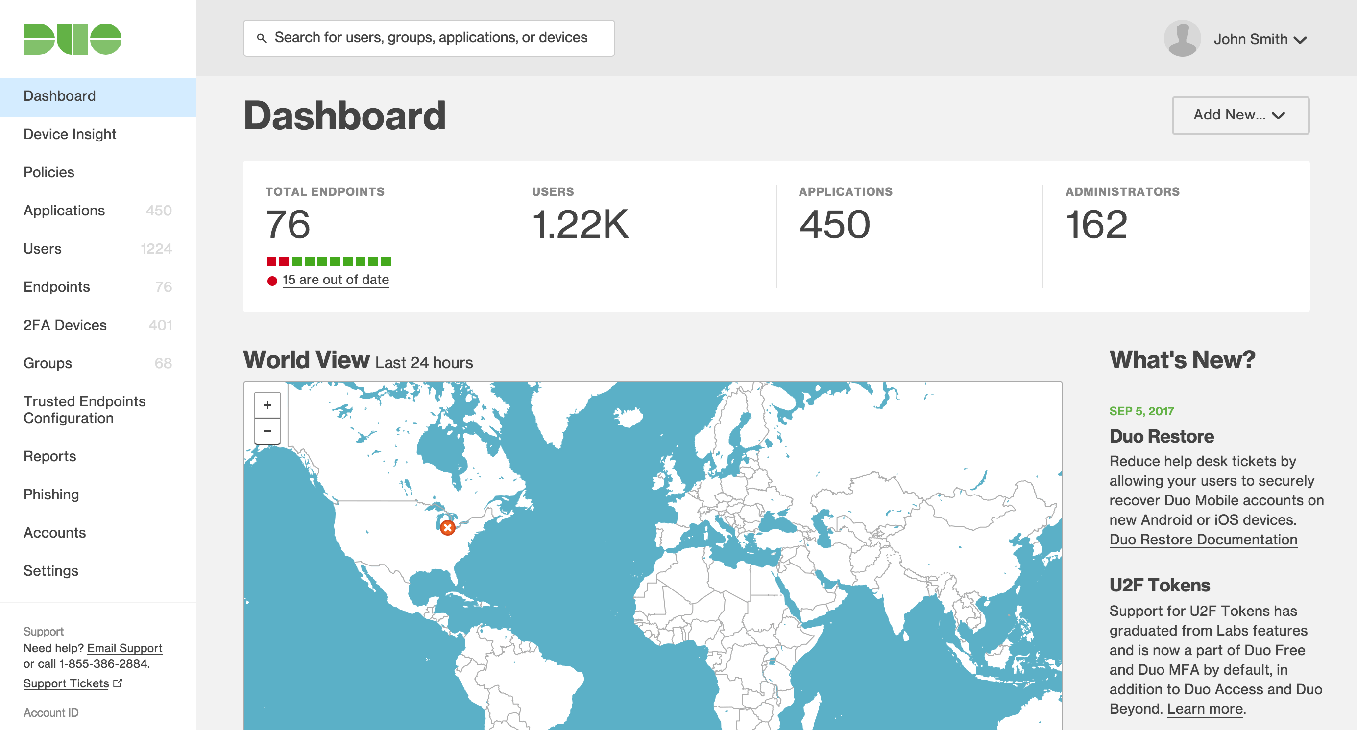
This sort of visual shift creates a mental break in workflow for the user as they reorient themselves to their new surroundings.
You could argue that this will happen regardless because the Duo.com site and the Admin Panel will always look different when it comes to where things are placed and just how much content or visual elements are on the page. And that would be a true statement. But we can mitigate this by creating a strong visual connection or language between these two entities so that the transition feels natural and the amount of time to reorient is minimal.
Visual consistency is more than just looking the same; it’s how we at Duo show that we care about how you experience our product, interacting with our marketing materials, or kicking back and watching one of our fun videos. It creates a seamless experience that proves that we are serious about being the most loved brand in security.
Let’s take a look at how we achieved that consistency without changing any of the functionality you know you and love. We intend to roll this out with our October new features release - sit tight and enjoy the nerdy design thoughts.
Colors
We examined the colors currently being used on Duo.com to determine what additional visual consistency we could build on from there. Even with this foundation, there are countless choices and considerations that go into choosing a color palette.
One needs to consider where the colors are going to be used, how they’re being used, the frequency of which the user sees the color, any previous biases that may come with that color, just to name a few. With that in mind, we set out to revamp and expand our color palette in the Admin Panel. First of all by looking at the colors we were using for our text and our button/link UI (user interface) elements.
Links and Buttons
Links and buttons are the most commonly used UI elements, which means the right color choice is critical. You want the colors to be uniform enough that they feel like a set of the UI while not being too overpowering, nor command too much attention away from the content on the page as a whole — the meat of what you want the user to consume or interact with. On top of all of that, you want to ensure that the colors you use have enough contrast so that all intended audiences can actually see them. That’s a tall order.
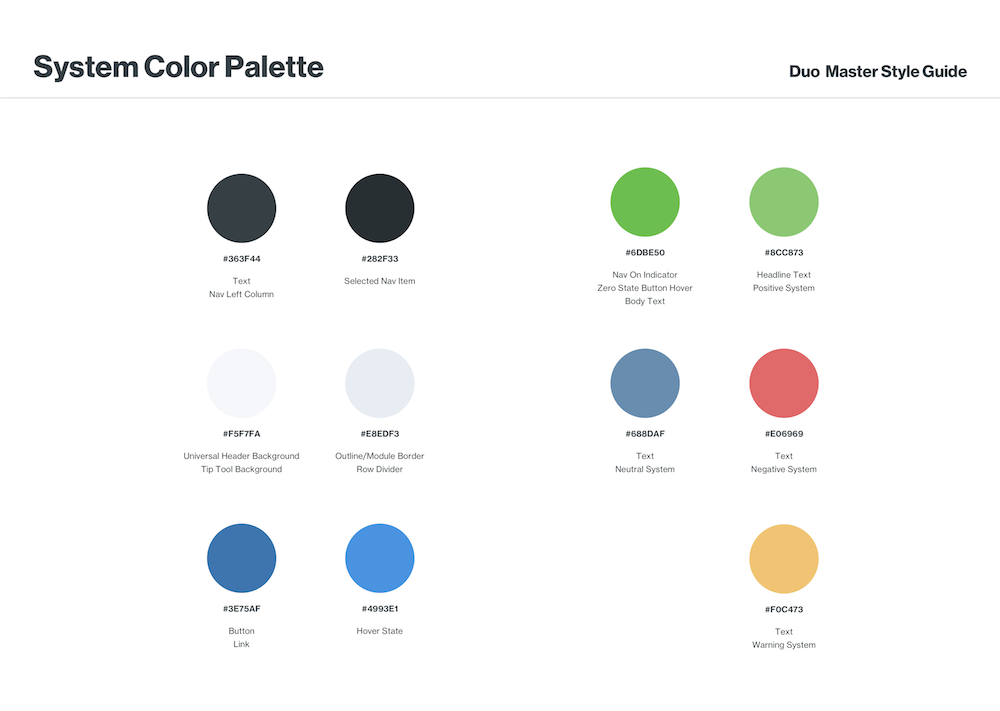
We decided on a calming blue as the default color for links, and a darker-colored text link as a backup for very specific circumstances. The blue links create contrast when placed inline with body copy to alert the user to interactive elements.
That blue is carried over into the buttons to unify the buttons and links together, building a strong pattern that when you see this blue, you can bet your bottom dollar that it’s something you can interact with. At the same time, we’re removing additional colors from our secondary buttons and our destructive buttons to help create a visual balance between the secondary navigation areas and the page content.
Graphs and a Secondary Color Palette
The second and most difficult renovation to the color palette would be the creation of a secondary color palette reserved for use with graphs. The challenge was striking a balance between a large set of colors that fit into the core color palette, while creating a cohesive, well-balanced set of colors that can be mixed and matched together, but not so vibrant or dominant that they detract from the data on page. Graphs are a visual way of conveying a set of data and should not overpower the labels or additional text elements that help display that data in a text format.
This was achieved by identifying colors already in use for our color palette (such as red and green). This also includes colors that hold previously established biases through common association or existing uses in our Admin Panel — these include colors such as yellow and orange, which are commonly associated with warning or error messages, as well as a particular shade of blue that we currently use to display info messages.
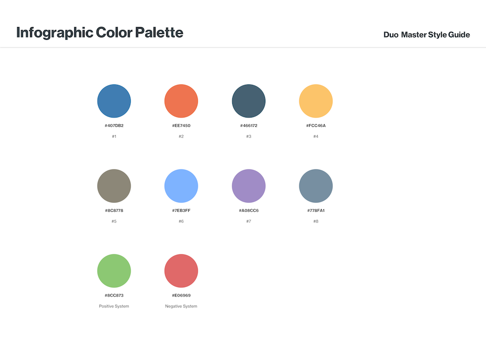
After constraints are defined, we created a cohesive palette that can be reserved only for use in infographics - cooler colors tinted white to make them less visually dominant on screen.
UI Updates
Admin Panel Dashboard
The dashboard is the landing page of the Duo Admin Panel, so it’s a great place to establish UI patterns with the user. Here, we have to strike a visual balance with the general UI elements and the data overview for our administrators. We also had to take into account additional layout changes that may come to this page in the future — so it’s not just designing for the moment, but planning for a continually evolving system.
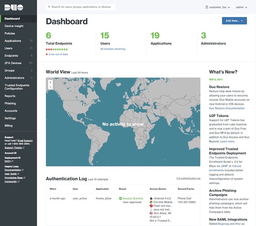
We started by eliminating background colors that artificially broke up sections of content into blocks. These boxes added unnecessary visual clutter and make it difficult for users to quickly scan the page, so we removed them.
Navigation
I’m sure some people have been wishing for a night mode of the Duo Admin Panel - now customers receive it by default! This change was made primarily for two reasons:
- The navigation should both help to anchor the application to the screen, but at the same time, not hinder the readability of the content. (If you haven’t noticed, giving prominence to the content on the page is going to be a reoccurring theme.)
- Users should be able to quickly glance at the navigation and see where they are, and if the page is a child page inside of a section, or has additional child pages of its own
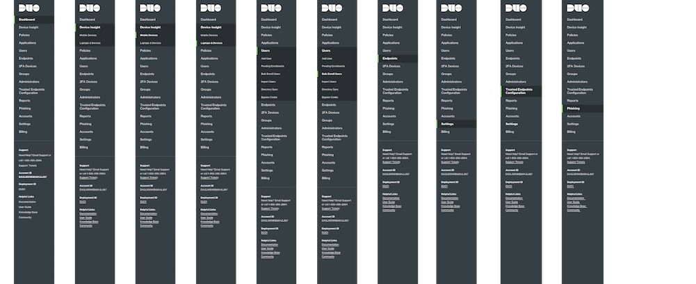
Beyond the main navigation, we took steps toward better defining what the secondary level navigation looks like. We needed a solution that could accommodate a range of button or link types while signifying to the user that they’re actionable.

To this end, we opted to change the link color to grey, while only allowing the blue primary action button to persist. What this does is lower the visual footprint of the secondary navigation, allowing for flexibility when used inline with content on the page or at a top level, acting as global navigation for each page/section.

Policy Editor/Creator Modal
We decided to give considerable attention to this specific UI element. Before, we were using inconsistent visual patterns to indicate which attributes on a policy were enabled.
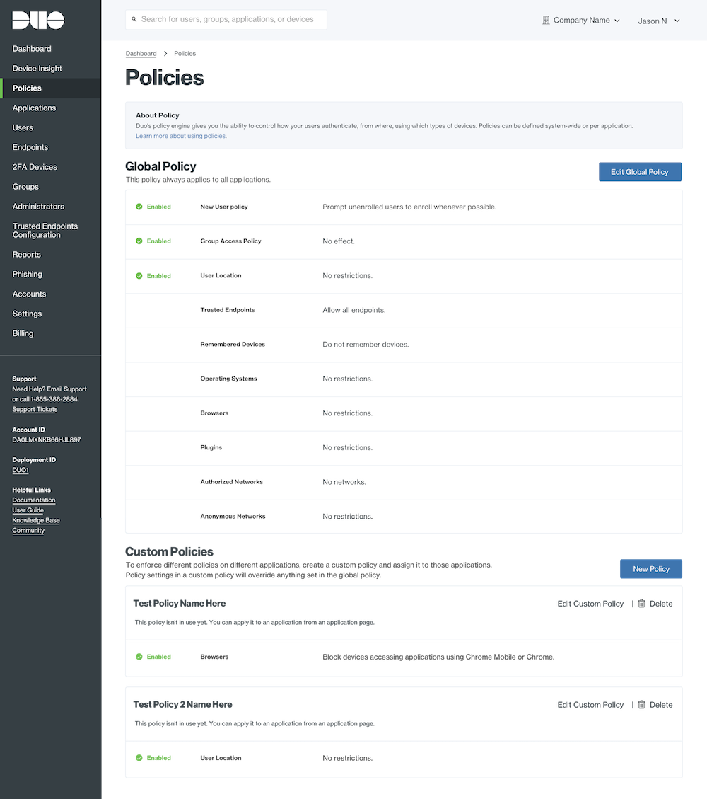
To help support a distinct and clear visual indicator of an active policy, we chose to remove the policy icons. Icons are meant to serve as shorthand for meaning. Through user testing, we found that this was not the case at all with our policy icons.
Instead, they became more visual clutter than visual cue, so we switched them to something more useful. Making them checkmarks clearly reinforces that this particular attribute has been enabled, and the addition of the “enabled” text helps to reinforce the checkmark, as well as making it screen reader accessible. Conversely, when a policy is disabled, this checkmark simply is hidden.
The new checkmark icon and pattern is reused inside the policy modal’s left-hand navigation, simply showing whether a policy has been added and enabled or not.
The last thing we focused on was where the policy modal appears on screen. Right now, it simply centers itself on screen. This is pretty common for modals, but it wasn’t following other patterns in our admin panel.
So we took cues from how other content is visually aligned on the page and anchored the modal to the left navigation.
Anchoring it to the left navigation keeps it from floating above the interface and gives it a concrete position to live. This allows us to mimic the layout of page beneath the modal. Creating a familiarity with where the eye is supposed to go inside of the modal.
Pop-Up Notifications
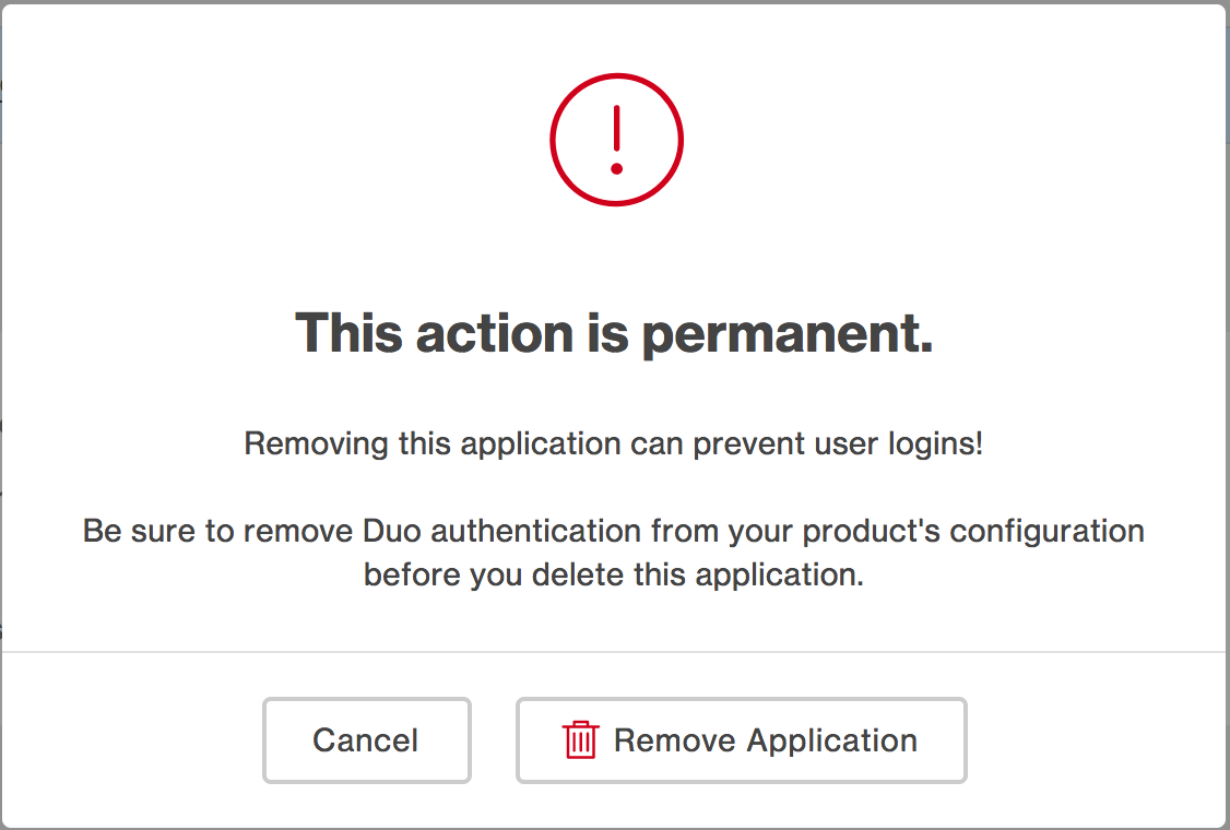
Now, the policy modal is not the only modal in our interface. We use pop-up notification modals for a number of activities, including confirming actions. But these modals were using their own library of icons, creating visual clutter. As a result, we’re striking the iconography that has typically been used to indicate if you were just getting an informative pop up or a warning.
Instead, we will represent destructive actions by highlighting the text in red. In the instance of a destructive modal, there will be header text that clearly defines what you are removing and highlights it by displaying it in red. Additional reinforcing text will be provided underneath to describe the action that you are about to perform. In the case of an informative pop-up, we simply do not provide the header text in red.
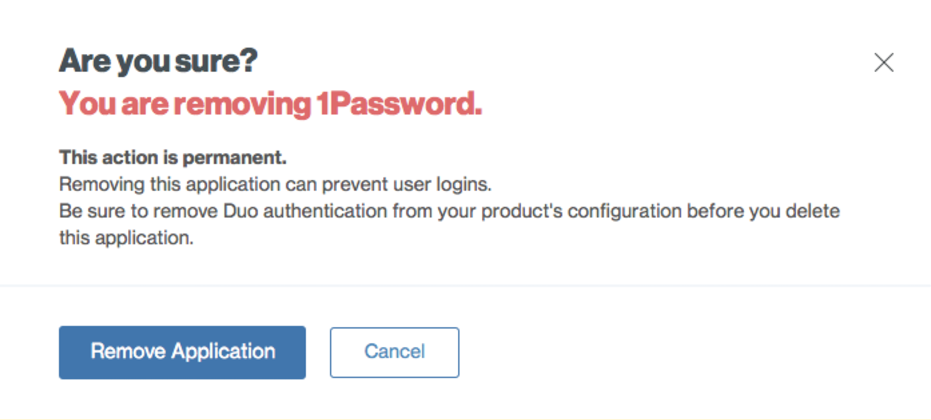
That said, we are adding a familiar global icon to modals: the close button. Right now, we don’t provide a close button to users, which doesn’t follow best practices.
Finally, we swapped the order in which the buttons in the modal appear. Right now, the call-to-action button is typically on the right with both buttons centered in the middle of the modal. This is counterintuitive to how users typically interact with pop ups, so we moved the buttons over to align with the left edge of the copy and made the call-to-action button the first button displayed with the secondary or cancel button being displayed after it.
Settings Pages
The design thinking applied to the settings page was really a solution for how we present all longform layouts in the Admin Panel. Previously in the Admin Panel, we followed best practices for keeping labels aligned next to their respective input fields in order to build a stronger association between categories and open fields. However, we’re not breaking away from best practices in our modification of this long form design, but rather optimizing it for better scannability when presenting a large number of fields to the user.
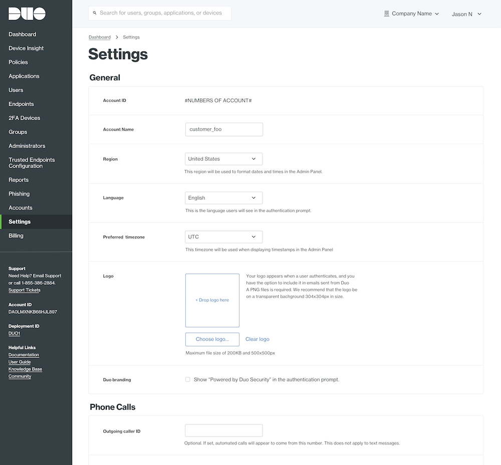
Labels are still being kept inline with their respective fields but, instead of being right aligned to the input field, they’re left aligned. Why? It creates a hard left visual edge along the labels which allows the user’s eye to quickly follow down the list and scan each label. This means that users have an easier time finding the one attribute they need to update. Since that means the text moves slightly farther away from the input field, we added subtle borders to better break up the content into groups. This helps define some structure to the page and also helps users find a particular setting to update.
Overall
This may come across to readers as a drastic shift from what they’re used to seeing in the Duo Admin Panel, but we wanted to reassure you that every change we made came with the user's best interests in mind and a careful amount of consideration on our part. We hope you enjoy the update and look forward to future improvements we plan on making. We also hope that your experience interacting with all things Duo, including our website, marketing materials, videos, Admin Panel and the Duo Prompt are as seamless and enjoyable as possible.

